|
IN BRIEF
|
In the dynamic realm of layout design, mastering the art of grid implementation is akin to discovering a secret weapon. Grids serve as the invisible scaffolding that supports the visual architecture of your projects, transforming chaos into harmony. Picture your designs as a symphony, where grids are the notes that guide the crescendo of creativity. Whether you’re crafting a website or print material, understanding how to effectively deploy grids can elevate your work from ordinary to extraordinary. From modular grids that foster flexibility in e-commerce designs to hierarchical grids that emphasize storytelling, each type comes with its nuances. Unlock the potential of your layouts by embracing these grids, ensuring your designs not only catch the eye but also facilitate a seamless user experience.
Understanding the Importance of Grids in Design
The role of grids in layout design cannot be overstated. They serve as the fundamental framework that organizes visual elements, ensuring coherence and harmony throughout a project. By implementing grids, designers establish a sense of order, making content more accessible and engaging for the viewer. A well-structured grid not only enhances aesthetic appeal but also fosters better user experience, guiding the audience’s eyes in a purposeful manner.
Creating a Strong Foundation: Types of Grids
Before diving into the mechanics of grid implementation, it’s vital to understand the different types of grids available. Each serves a unique purpose and can greatly influence the overall design.
Modular Grids
A modular grid consists of rows and columns that create a rectangle or square-based layout. This type of grid excels in portfolios and e-commerce platforms, where flexibility is crucial. Designers can rearrange content easily while maintaining a coherent flow. The modular approach allows for scalable designs, accommodating varying amounts of content without sacrificing organization.
Hierarchical Grids
On the other hand, a hierarchical grid emphasizes the significance of particular design elements. This grid is ideal for storytelling or blogging, as it allows key components to stand out. By manipulating the size and placement of modules, designers can guide the viewer through a narrative, providing visual cues that enhance comprehension.
Implementing Grid Systems Effectively
The integration of grid systems into your designs requires careful planning and attention to detail. Here are actionable steps to help you master the art of grid implementation.
Defining Your Goals
Before starting with grids, clarify the objectives of your design. What message do you want to convey? Who is your target audience? Understanding these aspects will assist in choosing the appropriate grid structure. For instance, a clean and minimal grid may suit corporate websites, while a more dynamic grid would better serve creative portfolios.
Choosing the Right Tool
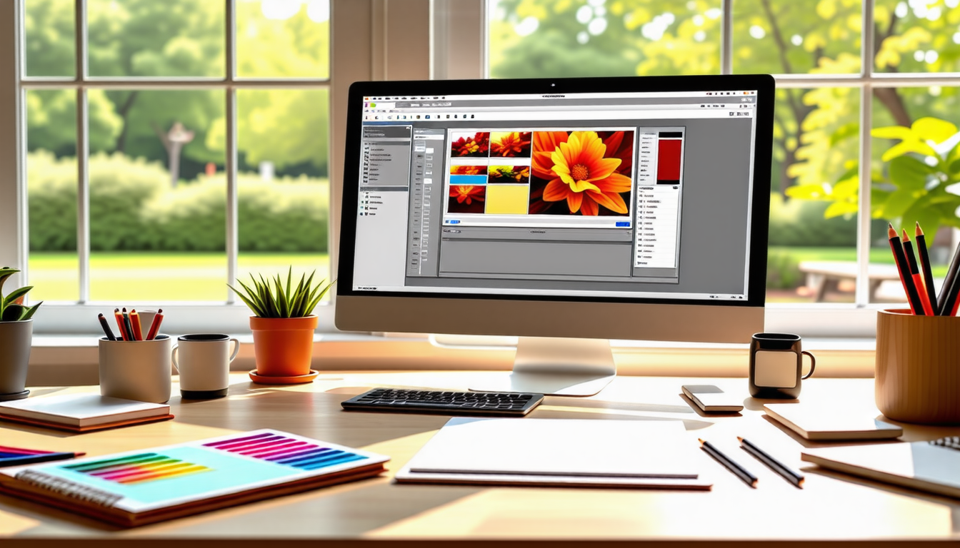
Today, a myriad of digital tools facilitate grid creation. Software such as Adobe InDesign is powerful for print layouts, while Sketch and Figma are excellent choices for web and UI design. These applications incorporate built-in grid systems, streamlining the process of aligning elements and ensuring precise layouts. Familiarizing yourself with these tools can significantly enhance your workflow and output quality.
Establishing Columns and Margins
Once you have defined your goals and chosen the right software, the next step is establishing the columns and margins that will serve as your grid’s backbone. The columns dictate the alignment and flow of content, while margins ensure that elements have breathing room. Appropriate column widths and margin settings contribute to a balanced layout, preventing clutter and enhancing readability.
Visual Hierarchy in Grid Design
Incorporating visual hierarchy into your grid layout is essential for guiding user attention. By manipulating the size, color, and placement of elements, you can reinforce the importance of certain content over others.
Using Size and Color
Utilizing varying sizes for elements within your grid can create a clear hierarchy. Larger items naturally attract more attention, so consider placing key components or headlines in larger fonts or containers. Additionally, color can play a pivotal role. Bold, contrasting colors can highlight call-to-action buttons or important text, effectively directing the viewer’s gaze where needed.
Utilizing Whitespace
Whitespace, or negative space, is often overlooked but immensely powerful. Adequate spacing between elements helps to avoid overwhelming the viewer. Strategically placing whitespace within your grid can enhance clarity, improve focus on crucial elements, and provide a visually pleasing experience. Less can indeed be more when whitespace is effectively employed.
Responsive Design and Grids
In today’s multi-device world, responsive design is non-negotiable. Ensuring your grids adapt seamlessly across various screen sizes is critical for maintaining usability.
Creating Fluid Grids
Fluid grids are a solution for responsive design. Unlike fixed grids that rely on specific pixel values, fluid grids use percentage-based widths for elements. This flexibility allows content to scale according to the screen size, ensuring a consistent experience across devices. Learn more about responsive layouts to enhance your skills further.
Utilizing CSS Grid and Frameworks
When working with web designs, tools like CSS Grid and frameworks such as Bootstrap simplify the process of applying grid systems. These utilities facilitate responsive design, allowing you to structure layouts with ease. They come equipped with a plethora of grid options that ensure flexibility, making your designs adaptable and user-friendly.
Working with Grids and Guides
Using grids and guides effectively can elevate your design quality significantly. These elements help maintain perfect alignment, a hallmark of professional design.
Implementing Guides for Precision
Grids and guides allow designers to “snap” objects into place, perfectly aligning elements while minimizing effort. Most design software provides options for setting up guides, ensuring elements remain organized consistently. This approach allows designers to maintain precision, aligning components effortlessly and achieving a polished look in their layouts.
Nesting Grids for Complexity
Nesting grids can enhance complex layouts by providing additional structure. For instance, within a modular grid, you can introduce smaller grids for particular sections. This technique enriches the organization of intricate designs, permitting a clear hierarchy and layout balance without resulting in chaos.
Real-World Applications of Grid Design
Grids aren’t just theoretical constructs; they have practical implications in the real world. Their strategic application can be seen in various fields, from advertising to web design.
Web Design Examples
In web design, corporation websites often utilize grid systems to delineate information in a digestible manner. E-commerce platforms benefit from modular grids to display products creatively while preserving clarity. Check out examples of effective use of grids across different types of layout designs to inspire your next project.
Print Design Applications
In print design, like brochures or magazines, grids help in maintaining visual consistency throughout the publication. By aligning images and text within predetermined grids, designers craft pages that are not only visually appealing but also easy to navigate. The use of grids in print maximizes optical harmony and enhances the reader’s experience.
Conclusion of Grids in Layout Design
Understanding the nuances of grid implementation can transform chaotic designs into organized masterpieces. By recognizing the importance of grids, employing effective strategies, and utilizing the right tools, designers can create layouts that engage, inform, and inspire. To further refine your design skills, explore these resources on visual hierarchy techniques and creating digital collages to broaden your grasp of these essential elements in modern design.
In the realm of layout design, the effective implementation of grids is paramount for creating visually appealing and functional compositions. Recent studies suggest that designs employing grids can increase user engagement by up to 30%. This improvement is largely due to the clarity and organization that grids bring, allowing viewers to navigate content intuitively.
To achieve this, it’s essential to choose the right grid system based on the project’s needs. For instance, modular grids are particularly versatile, combining rows and columns to provide flexibility, while hierarchical grids can emphasize key elements, making them ideal for storytelling or blogs. Tools like Adobe InDesign and Sketch facilitate this process with their built-in grid features, offering designers straightforward ways to align and adjust elements seamlessly.
Moreover, nested grids enhance complex layouts by allowing for deeper organization of content, ensuring visual consistency and balance. This structuring can lead to designs that are not only aesthetically pleasing but also significantly improve user experience, encouraging users to linger longer and interact more deeply with the content.
By utilizing grids effectively, designers can transform their layouts into organized masterpieces that captivate and effectively communicate their messages.
To effectively implement grids in your layout design, begin by understanding the fundamentals of grid systems. Identify the type of grid that fits your project—be it a modular grid for flexibility or a hierarchical grid for storytelling. Tools like Adobe InDesign, Sketch, and Figma can facilitate seamless integration of grids, ensuring alignment and balance throughout your design. Plan your layout meticulously, paying attention to margins, columns, and guidelines that serve as a visual framework. Remember, the purpose of a grid is not to limit creativity but to enhance it, guiding the viewer’s eye naturally across the page while maintaining an organized and professional appearance.
FAQ
What are the main benefits of using grid systems in layout design?
R: Grid systems provide structure and organization to your layouts, allowing for better alignment and visual harmony. They help guide the viewer’s eye and can lead to a more professional and polished appearance in your designs.
Which software tools are best for implementing grids?
R: Some of the top software tools include Adobe InDesign for print layouts and Sketch or Figma for web and UI design. These tools come with built-in grid systems that simplify the process of aligning elements.
How can I ensure my grid system is responsive?
R: To create a responsive grid, consider using CSS Grid or frameworks like Bootstrap. These technologies allow for flexible layouts that adapt to different screen sizes by defining columns and rows that can expand or contract as needed.
What types of grid systems are there, and when should I use them?
R: There are several types of grid systems, including modular grids, which offer flexibility, ideal for portfolios; and hierarchical grids, which emphasize key elements, perfect for storytelling or blogs. Choose a grid based on your design goals and content structure.
How do I create a custom grid system for my designs?
R: To create a custom grid, start by defining the number of columns, margins, and gutters. Sketch a layout plan, ensuring consistency across all elements. Utilize grid features in design software to align everything accurately and maintain visual balance.