|
IN BRIEF
|
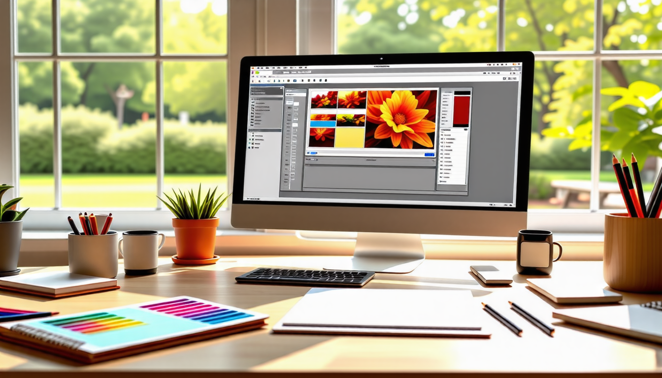
In the vibrant world of design, color is far more than a mere aesthetic choice; it is a pivotal element that captivates the human spirit. Color psychology reveals how shades and hues shape perceptions, stir emotions, and ultimately guide decision-making. Imagine the warmth of a sun-kissed yellow embodying optimism, while deep blue shades evoke trust and calm. As designers, mastering the intricate dance of colors not only enhances visual appeal but also constructs deeper connections with audiences. Each color carries its own set of psychological implications, enabling brands to convey messages, establish identities, and influence behaviors. Understanding these psychological effects is essential for creating designs that are not only pleasing to the eye but also resonate profoundly within the hearts and minds of viewers.
Color psychology plays a vital role in the world of design, impacting how individuals perceive and interact with visual content. The nuanced influence of color can evoke emotions, influence behavior, and shape brand identities. Understanding the dynamics between color and human perception is essential for designers seeking to create impactful visuals.
Conclusion: The Path Forward in Color Design
As designers continue to explore the intersection of color psychology and design choices, it’s clear that thoughtful color selection is paramount. Systems, strategies, and an understanding of human behavior will guide their practice in creating visually impactful and emotionally resonant designs. Future endeavors will undoubtedly build upon this foundation, revealing new possibilities for engaging audiences through the power of color.
To further enhance your design strategy, consider looking into best practices for designing website graphics, as well as engaging social media graphics to connect with audiences more effectively.
The Emotional Impact of Colors
The choice of color can significantly affect how users engage with a design. For example, red is often associated with passion, urgency, and excitement, making it a favorable choice for call-to-action buttons or promotional materials. In contrast, blue evokes feelings of trust and calm, which explains its prevalence in corporate branding and healthcare design. By leveraging these emotional connections, designers can influence user perceptions and behaviors with thoughtful color selections.
Color psychology is a fascinating field that examines how different colors affect human emotions and behaviors, significantly influencing design choices across various platforms. Recent studies indicate that approximately 90% of snap judgments made about products can be based on color alone. This statistic underscores the importance of careful color selection in branding as companies seek to foster positive user perceptions and establish a clear identity in a competitive marketplace.
For instance, while blue often evokes feelings of trust and calmness, making it a popular choice for banks and tech companies, red can stimulate urgency and passion, often used in clearance sales or food marketing. Transitioning into softer tones, it’s noted that green promotes a sense of tranquility and health, frequently employed by brands looking to emphasize sustainability or relaxation.
Moreover, the combination of colors can enhance or detract from user experience. For example, using a high-contrast palette can improve readability on digital platforms, while a well-balanced scheme in interior design can create an inviting atmosphere. This intricate relationship between color and perception makes understanding color psychology essential for both physical and digital designs, as explored in resources like this guide and book cover design insights.
Color plays an essential role in visual communication, influencing not just aesthetics but also human emotions and behavior. When brands thoughtfully select their color palettes, they tap into the psychology behind these choices, forging stronger connections with their audience. Colors can evoke feelings of trust, excitement, or even calm, impacting user experience across both digital and physical environments. Each hue carries its unique psychological implications: for instance, blue often conveys dependability, while red stirs up passion. Hence, understanding color psychology is not merely an artistic endeavor; it is a strategic approach to enhance brand identity, drive consumer action, and create designs that resonate deeply with users.
FAQ
1. How does color psychology influence consumer behavior?
R: Color psychology affects how consumers perceive brands and products. For instance, warm colors like red and orange can evoke feelings of excitement and urgency, potentially leading to impulsive purchases, while cool colors like blue can promote trust and calmness, influencing consumers to feel more secure in their decision-making.
2. What role do colors play in establishing brand identity?
R: Colors are crucial in building a brand’s identity as they communicate specific emotions and values. Consistent use of certain colors helps brands to be easily recognizable and can create lasting associations in the minds of consumers, ultimately affecting brand loyalty.
3. How can the psychological effects of color be applied in design?
R: Designers can leverage the psychological effects of color to evoke desired emotional responses from users. For example, using yellow can create a sense of optimism and energy, while green can promote feelings of tranquility and health, helping to connect the design with the intended message effectively.
4. What are some common consequences of poor color choices in design?
R: Poor color choices can lead to confusion, misinterpretation of a brand’s message, and even customer disengagement. In user interfaces, it can result in negative user experiences, making it hard for users to navigate or understand the content, ultimately reducing the effectiveness of the design.
5. Can color schemes affect our emotional states?
R: Yes, different color schemes can significantly impact our emotional states. For instance, a well-balanced palette of soft blues or greens can instill a sense of calm and relaxation, while a vivid mix of reds and yellows can energize a space or enhance mood, thus influencing our overall experience of the environment.